Here’s an underappreciated fact about higher education in the United States: Most college students in the United States and its territories attend a public college or university that admits most or all applicants.
In 2020:
- 80% of undergraduates attended a public institution of higher education (IHE), according to the Department of Education’s Integrated Postsecondary Education Data Survey (IPEDS).
- 75% of undergrads went to a public institution that admitted more than half of all applicants.
- 9% of undergrads went to an IHE that admits less than half of its applicants.
In order to help people see more clearly where undergrads go to college, we used Tableau to create eight different views of undergraduate enrollment in 2020.
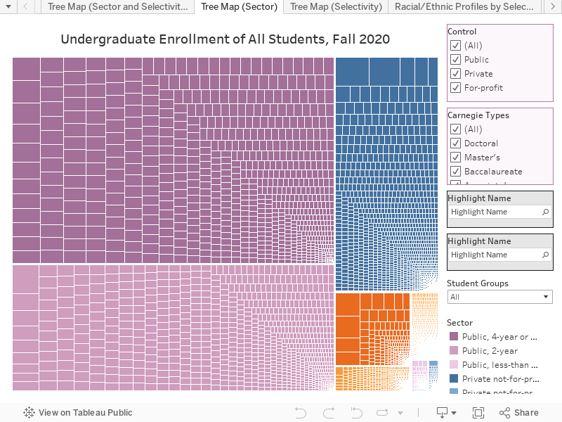
Here is tree map showing where undergrads go to college (tab 1):

The chart above uses data for full- and part-time undergraduate students in all U.S. states and territories for fall 2020-21, collected and published in IPEDS. Each cell represents an IHE; the size of each cell corresponds to the number of undergraduates enrolled there. The chart is a screenshot from the interactive Tableau presentation at the end of this post, which presents multiple views of this data and also allows you to sort by race/ethnicity and by Pell-eligibility.
Why It Matters Where Students Go to College
Most college students certainly do not go to a college with a single-digit acceptance rate, but you would not know that from many national newspapers and college rankings, which are obsessed with what have been called highly rejective colleges. While the headlines of 73% of the stories written by the New York Times’ main higher ed reporter over a two-year period featured just four Ivy League universities, those universities enrolled 0.16% of all undergraduates in 2020. It is a bit like if the Times national politics reporters only covered Wyoming.

It is fairly safe to say that when we talk about the Ivy League or the top 50 universities in the US News and World Report Best Colleges we are not in fact talking about higher education as most Americans encounter it.
That’s not to say that it isn’t important to expect more of elite institutions when it comes to diversity and access. It is important, because those institutions have an outsized effect on who goes on to earn graduate and professional degrees or to acquire great wealth.
It is essential to say, however, that if we only focus on fixing admissions in higher education reform, we are going to do nothing for the vast majority of undergraduates, who attend very accessible two- and four-year colleges.
The issues at the IHES attended by most American have much less to do with getting in and much more with staying in and getting out.
What matters most when it comes to retention and completion are affordability and support. Paying greater attention to where most students are actually enrolled can shape a higher education policy focused more on public institutions of higher education and on making them more affordable and increasing completion rates by providing better support for enrolled students. This visualization (tab 3) helps us see just how few students go to colleges that admit less than a quarter of their applicants. (They’re in the small blue box in the bottom right-hand corner.) It is also good evidence for the importance of continuing to fund and expand the U.S. Department of Education’s Postsecondary Student Success Program, which provides funding for evidence-based practices that increase graduation rates.

Visualizing where undergrads go to college also helps us see factors that determine who goes where. Compare, for instance, the tree maps (tab 2) of undergrads who did not receive Pell Grants (left) versus those who did (right).

The hierarchical order remains the same for both groups, but the share of the map occupied by for-profit colleges (shown in orange) grows significantly on the map showing just students enrolled with a Pell Grant, which is a federal grant that goes mainly to students from households below national median income.
Another visualization (tab 5) lets us see just how heavily for-profit colleges enroll students with Pell Grants. This number is cause for concern since the graduation rate at four-year for-profit colleges is not even half what it is at private and public four-year colleges.

Visualizing Where Students Go to College
The Tableau visualization below uses fall 2020 enrollment data for part- and full-time undergraduate students in the United States and its territories. There are eight tabs providing different visualizations of where people go to college. Feel free to share this post and download images from the visualization and use them in presentations, social media posts, etc. We only ask you to credit Education Reform Now if you do. You can expand the visualization to be whole screen by clicking the option to do so in the bottom right corner. The dataviz includes public, private, and for-profit IHEs that are four-year, two-year, and less-than-two-year institutions. You can search for individual institutions and limit many of the visualizations to particular student groups. We used the same terminology in IPEDS for demographic groups.