You would not know it based on media coverage of a small number of highly rejective colleges that enroll a tiny portion of all undergraduates, but most college students in the United States attend a public college or university that admits most or all applicants. These six charts reveal a much different picture of undergraduate education in the United States in 2023 (the most recent year for which data is available).
1. 76% of undergraduates attended a public institution of higher education, according to the Department of Education’s Integrated Postsecondary Education Data Survey (IPEDS).

2. 89% of undergrads went to an institution that admitted more than half of all applicants.

3. Just 2% of undergrads attended a private college or university that accepted less than a quarter of all applicants. 12 times as many students are enrolled in a community college than are enrolled in the so-called “elite” colleges.

4. Less than one percent of undergraduates attend institutions with endowments worth more than $500,000 per student (the amount that makes them subject to a federal endowment tax). They are highlighted below.

5. Here is another view of just how few students attend this handful of mega-wealthy institutions.

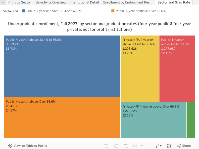
6. More than three out of five students at four-year colleges and universities attend an institution where less than two-thirds of students earn a degree there.

My hope is that these visualizations will prompt a range of questions and conclusions. One conclusion I’m led to is that the major issues at the postsecondary institutions attended by most American have much less to do with getting into college and much more with staying in and graduating.
Paying greater attention to where most students are actually enrolled should shape a higher education policy focused more on public institutions of higher education than on a tiny number of highly selective institutions. That policy should emphasize making accessible institutions more affordable and increasing completion rates by providing better support for enrolled students. Greatly expanding the U.S. Department of Education’s Postsecondary Student Success Program, which provides funding for evidence-based practices that increase retention and graduation rates, would be a good start.
Methodology
In the first three and final tree graphs above, each box represents a sector. In the fourth graph, each one represents an institution. The size of each cell corresponds to the number of undergraduates enrolled there. The charts are all screenshots from an interactive Tableau visualization found below (thanks to Jon Boeckenstedt for making these charts). All but the last chart are based on all full- and part-time undergraduates enrolled in a postsecondary institution in the United States and its territories in fall 2023-24, which is the most recent year for data shared by the U.S. Department of Education’s invaluable free public survey of higher education, IPEDS (long may it last!). We chose to focus on four-year institutions alone in the final chart because that is the sector in which degree completion is most unambiguously the intended outcome, rather than, for example, transferring, earning a short-term credential, or learning specific skills without earning a credential. The visualization presents multiple views of this data and also allows you to sort by race/ethnicity, by Pell-eligibility, endowment size, and other elements. You can also look up individual institutions in the fourth view.
Feel free to share this post and download images from the visualization and use them in presentations, social media posts, classwork, etc. We only ask you to credit Education Reform Now if you do.